Good Design Thursdays - Entry #54
Here are three awesome logo's from Maryland area business's. I love the simplicity in the approach used for each of these - a nice sans serif font, paired with a single graphic element that represents their product.
Here are three awesome logo's from Maryland area business's. I love the simplicity in the approach used for each of these - a nice sans serif font, paired with a single graphic element that represents their product.


So apparently NASA produces a poster for each space mission. Many of them are parodies of existing movies, posters or film franchises and, just as the attached article says, they are "hilariously awkward." As bad as the majority of them are, there are a few that I actually like quite a bit and have included them here. If you want to check them all out, here is a link...
https://www.boredpanda.com/nasa-space-mission-posters/?utm_source=facebook&utm_medium=social&utm_campaign=BPFacebook


Sometimes all you need is a new perspective.


The U.S. Postal Service has a long history of issuing commemorative stamps. The subjects featured on the images encompass nearly everything or everyone you could think of - historical figures and events, animals, plant, music, sports and pop culture. While many sheets simple feature the stamps themselves, some also expand the presentation with artistic borders, or even allow the art of the stamps and borders to overlap. Here are a few of my favorite stamp sets from pop culture.


Large neon and light-up signs can make a powerful statement. Many are iconic and instantly identifiable with the neighborhood or city where they are located. While the industrial look and feel of the structure and design can be appreciated even during the day, it's when the sun sets and the signs come to life that shows just how impressive the designs are, especially those that can be seen from a distance.


It’s cold outside. I thought about choosing designs this week to help warm the spirit, instead here are some nice designs that go the icy route.


Drew Struzan apparently can not stay retired, which is just fine with me. Fandango has premiered the uncropped artwork for three new posters he has done for the "How to Train Your Dragon" trilogy. One for each film. No official word yet on how or when these will be available, but I am betting they will be mini posters sent to anyone who orders tickets for the new film thru Fandango. It's always a treat to get new art from Struzan and it's even nicer to see it without all of the logo and text in the way.


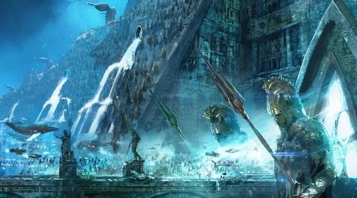
Every movie begins with an idea and filmmakers rely on concept artists to visualize those ideas. Some ideas don't make it past the concept stage and often the ones that do change quite a bit before making it into the film. This week I came across an nice article on ComicBookResources.com that showcases twenty pieces of concept art from the Aquaman movie. A few of my favorites are included here, click the link to see the rest...


Rian Hughes began his career as an illustrator and now has become one of the most successful and sought after graphic designers and font designers. He has worked for a wide range of publishers in the music, advertising and toy industries, as well as book and comic book publishing. It is in the world of comic books that he is possibly most well-known, as he has designed countless logos for nearly every comic book publisher.


This week we’re going back to the late 80’s/early 90’s, when we almost, sort of, got big screen versions of Captain America and the Fantastic Four. Captain America was the closest of the two to almost be released in theaters. This one-sheet was actually sent out to theaters, before the studio pulled the plug and released the movie straight to video. Fantastic Four was a different story. The movie was never intended to see the light of day. The studio made the movie solely so that their rights to the franchise would not expire. At the time, not even the cast or crew knew they were making a movie no one would see, though eventually bootleg video copies got out. Regardless, of the quality of the films themselves, we still got two really nice posters.


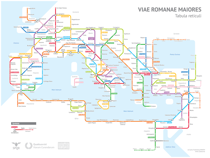
I love the geometric simplicity of Metro maps. Here are the Metro maps for Washington D.C., Delhi, and London. I've also included two very creative maps, though I don't know who designed them. In the first, the system of ancient Roman roads was reimagined as a Metro map and the last image shows a concept of what Earth could look like with all of its major cities connected by a Metro System.


One of the joys of the Fables comic book series, was that it consistently featured some of the best cover illustrations, month after month. Two of the issues during its award-winning run had Christmas themed stories - issue #56, with a cover by James Jean, spotlights Santa Claus on his yearly task of delivering presents, while issue #112, by Joao Ruas, depicts the ghosts of Christmas' past, present and future.


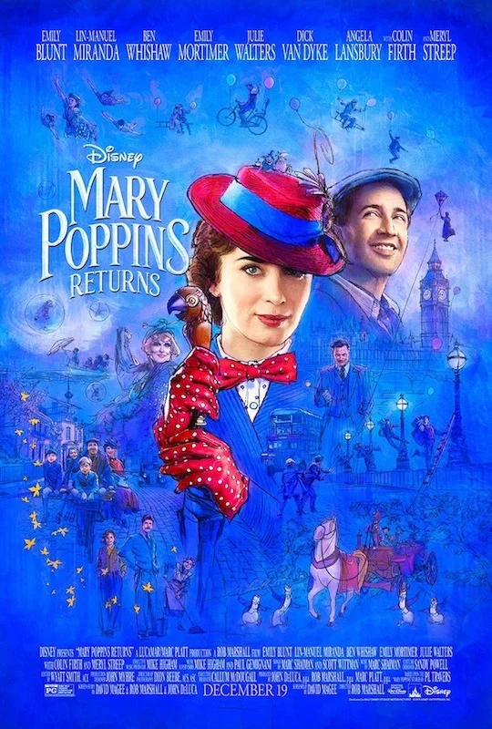
For Mary Poppins Returns, due out next week, Disney has issued this beautifully illustrated one-sheet. With a style reminiscent of Bob Peak, this feels like something that would gave been issued in the 1960’s, when the original film was released.
This week I'm looking at book design, specifically those from Chip Kidd. An author, editor and graphic designer, he is one of the most prolific book jacket designers of the last several decades, whose work has spanned every genre.


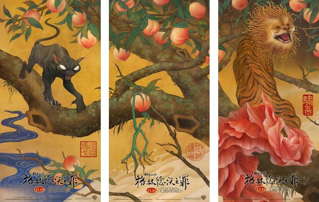
Warner Brothers released this wonderful Asian-inspired poster design for the new Fantastic Beasts film. Featuring the magical creatures from the movie, the layout was designed to allow for the image to be split into six individual posters.


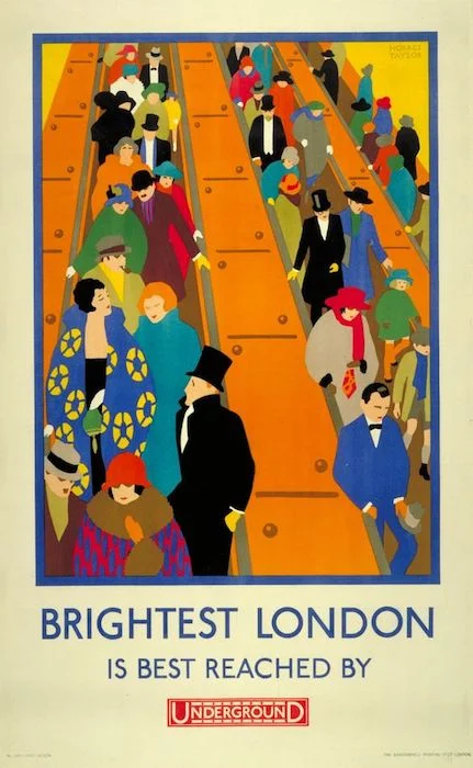
The London Underground has been around for over 150 years and has produced countless posters to promote it. Many of the posters are specific for each station and showcase a nearby local attraction or landmark. Here are a few I really like, produced in 1912, 1924 and 1927, respectively.


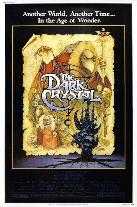
A few weeks ago the theme was 80's fairy tales, this week I'm revisiting that theme, but this time focusing on one filmmaker - Jim Henson. Not only did he produce some of the greatest fairy tale movies...yes, the Muppet Movie is a fairy tale..., but they also all have some of the best poster designs.


This week, those who exercised their right to vote received a sticker acknowledging their participation. While many voters received a generic flag sticker, some states handed out their own personalized stickers. Here are some really nice designs from Georgia, Louisiana, Nevada and New York.


This weekend is the opening for the new movie version of the classic fairy tale - The Nutcracker. The 1980's not only produced some of the best fairy tale movies, but also received some of the best posters to accompany them. Here is a really nice poster for the new Nutcracker, along with a few classic posters from 80's fairy tale movies.


There are a lot of great designs for Halloween related movies. Picking the images for this week’s post was actually harder than I thought it would be and could have gone in a lot of different directions. In the end, I settled on three that can be described as iconic, creepy and scary.