Good Design Thursday - Entry #5

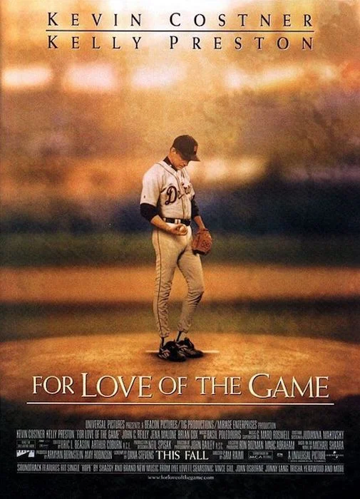
Yay baseball!  Opening Day is here!  What better way to celebrate the start of a new baseball season than by looking at some great movie posters.  First up is the one-sheet for the original "Bad News Bear" from 1976. Illustrator Jack Davis created a design with exaggerated caricatures of the actors, reminiscent of a MAD magazine cover, perfectly playing up the irreverent comic theme of the movie.  Next up is the one-sheet for "For Love of the Game" from 1999.  The muted colors and out of focus background add a sense of nostalgia...like looking at an old baseball card. Last up is the one-sheet for "42" from 2013.  This design has got so much raw energy, movement and passion, you can actually feel Chadwick Boseman's Jackie Robinson sliding out of the poster. 

entry_5-bad_news_bears.jpg
entry_5-for_love_game.jpg
entry_5-42_poster.jpg

Good Design Thursday - Entry #3

With St. Patty's Day this weekend, let's look at some beer posters. Walk into any bar, anywhere, and you're likely to encounter a poster or sign advertising some kind of alcoholic beverage. There have been posters advertising beer pretty much since that first keg was produced many years ago. If your town has a well-known local brew, like Natty Boh here in Baltimore, chances are there will be a sign for it on the wall. There will probably also be a sign for something known everywhere and nothing has a more catchy ad campaign than Guinness. When it comes to advertising beer, there are two traits that are common among almost every design...bright colors and happy, smiling faces.

entry_3-vintage.JPG
entry_3-natty_boh.jpg
entry_3-guinness.jpg