Good Design Thursday - Entry #1
Thursdays are boring. All you think about all day is “why can’t it be Friday?!” So I’m starting “Good Design Thursdays!” Each week I am going to share designs that inspire me in my own work. These pieces will come from everywhere - posters, book/record covers (do they even still make these?), websites, wherever. The only criteria will be that I feel it rises above the crowd and is worthy of a little praise.
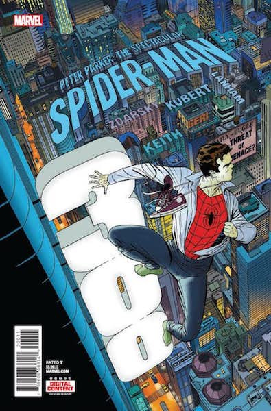
I really like designs that can weave typography into an illustration. "Peter Parker, The Spectacular Spiderman" recently reached its milestone 300th issue and Marcos Martin's iconic image of Spiderman hanging off a brightly lit sign of the issue's number, high above the city, reminded me of several other notable covers. The first is Walter Simonson's cover for "Batman" #366, from 1983. Here the title of the book is wrapped around the contours of the building, with the iconic image of Batman vs. the Joker taking a more prominent place above it. The next cover is from "Catwoman" # 50, from 2006. Artist Adam Hughes goes even further, incorporating not only the title, but all of the cover dress elements. The issue number and date of release are included with the title in the neon sign, while the Comics Code Authority logo and Batman head logo are included as smaller signs below it, swinging in the breeze.