Good Design Thursdays - Entry #74

NASA recently released the logo for the Artemis program, which is aimed at landing an American on the Moon by 2024. The design took some inspiration from the logo for the Apollo program. In order to get back to the Moon and beyond, NASA has been working on the Ares and Orion programs. Ares is the next generation of launch vehicles. Orion is the next generation crew exploration vehicle and will be NASA's successor to the space shuttle.

artemis-01.jpg
apollo.jpg
ares.jpg
orion.jpg

Good Design Thursdays - Entry #71

Today we celebrate the day we declared ourselves an independent nation. For some that means a day off work, cookouts and pool parties with family and friends and topped off with an evening of fireworks, but it's also a day to remember the ideals that this country was founded on. The three images I selected to showcase perfectly capture a few of those ideals. The most recognizable image of "Uncle Sam" we know today was created by James Montgomery Flagg in 1917 as a recruiting poster for World War I. The next image of "Rosie the Riveter" was created by J. Howard Miller in 1943 to inspire and rally together the war effort here at home. The final image, by Norman Rockwell, also first appeared in 1943. Like Rosie, it was designed to inspire people at home to support the war effort. Though all three posters were created during times of war and great hardship, their messages are no less powerful and inspirational today, and the ideals they represent should never be forgotten.

1917-James_Montgomery_Flagg.jpg
1943-J_Howard_Miller.jpg
1943-Norman_Rockwell.jpg

Good Design Thursdays - Entry #70

This year is the 50th anniversary of Apollo 11 landing on the Moon. This is also the 20th anniversary of the website Space.com. To commemorate both occasions, Space.com commissioned three posters from artist Melanie Lambrick and has made high-resolution versions available free for download from their site.

https://www.space.com/free-space-posters-celebrate-apollo-spacedotcom-anniversaries.html

Space-Panel 1.jpg
Space-Panel 2.jpg
Space-Panel 3.jpg

Good Design Thursdays - Entry #69

Two new works by Banksy appeared in Venice recently, coinciding with this year's Biennial Art Exhibition. One addressing the refugee crisis, with an image of a young migrant girl wearing a life vest and holding a flare. The other addressed the toll the tourism industry, in this case specifically massive cruise ships, is having on the ecosystem and eroding infrastructure of the city itself. His statement with this second one is amplified a bit considering that a week or two later a runaway cruise ship crashed into a Venice dock.

https://www.theartnewspaper.com/news/banksy-appears-to-have-painted-a-mural-of-a-migrant-child-wearing-a-lifejacket-in-venice

https://www.juxtapoz.com/news/street-art/watch-banksy-s-new-reveal-a-street-artist-in-venice/

banksy_3_venice_courtesy_photo_lapo_simeonijpg_4.jpg
Screen Shot 2019-06-02 at 4.00.12 PM.png
banksy_cruise_ship.jpg

Good design Thursdays - Entry #68

The Venice Biennale Art Exhibition is currently underway, running this year from May to November. One of the largest art exhibitions in the world, the pieces on display are spread throughout the city and features every type of art - painting, photography, sculpture, installations, video... you name it, it's there. The title for this year's exhibition is "May You Live In Interesting Times", which couldn't be more appropriate.

https://www.labiennale.org/en/art/2019

venice-biennale-2019.jpg
Shu_Lea_Cheang__3X3X6__mixed_media_installation_©_Shu_Lea_Cheang._Courtesy_of_the_artist_and_Taiwan_in_Venice_2019.jpg
main_900.jpg
SA4BPU_G.jpg

Good Design Thursdays - Entry #67

I love interesting architecture and train stations offer some of the best. Here is a really nice article that showcases some of the nicest and oldest stations around the country, including Baltimore's Penn Station (pictured here)...

https://www.usatoday.com/picture-gallery/travel/experience/2019/05/26/amtrak-train-stations-history-12-grand-stations-across-u-s/3695435002/

bs-md-amtrak-northeast-corridor-20150517.jpg
e681260bc6567c30643bd68479c5d4e3.jpg
elevated-element-penn-station-baltimore-2013.jpg

Good Design Thursdays - Entry #65

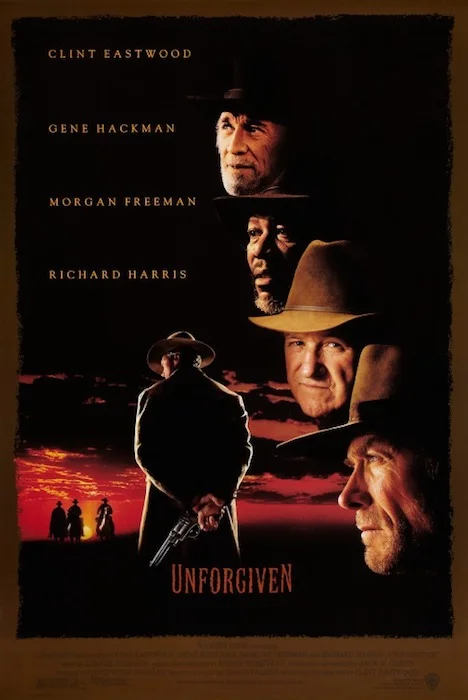
Bill Sienkiewicz is one of my favorite artists. Something I was not aware of, which he recently posted to his Twitter and Facebook feeds, is that he worked with legendary designer and artist Bill Gold on the design for the one-sheet for Unforgiven. Sienkiewicz posted these four comps he submitted for the poster's design. The comp chosen was then used for the layout of the photography for the final poster. It’s a shame the studio didn’t just use the illustration.

unforgiven_ver2.jpg
comp-01.jpg
comp-02.jpg
comp-03.jpg
comp-04.jpg

Good Design Thursdays - Entry #64

I’m a few days late getting this week’s entry up. Last week I looked to the past with the historic entrance sign for the Paris Metro. This week will be a kind of companion piece about a current project running in the London Underground. For the Underground’s 150th anniversary, artist Mark Wallinger was commissioned to create an art series. Inspired by the 2009 Tube Challenge, he created 270 unique labyrinths, one for each station in the London Underground and are on permanent display for travelers to view.

https://www.theguardian.com/uk/2013/feb/07/tube-150-birthday-labyrinth-art-project

56b0a082f6e1f2fef3430852c2ebbbce--london-art.jpg
419d9d49a8d9a8cee3368d6943d5c9d3--london-art.jpg
516d6d2738fd39c284569f1e88412234--london-underground-labyrinth.jpg
b2a66817b4177a51dda9ff28127e7f9a--london-underground-wembley.jpg
deb5999ddc7e8a12dd82f0789206390c--london-underground.jpg

Good Design Thursdays - Entry #63

This is a really nice recent article about the origin and history of the entrance signs for the Paris Metro. The design styles used span three major art movements, based on time period when the signs were installed - Art Nouveau, Art Deco and Minimalism. Many of the original signs still exist and are now protected historic sites.

https://mymodernmet.com/paris-metro-entrances/

paris-metro-entrances-2.jpg
paris-metro-entrances-4.jpg
paris-metro-entrances-6.jpg

Good Design Thursdays - Entry #59

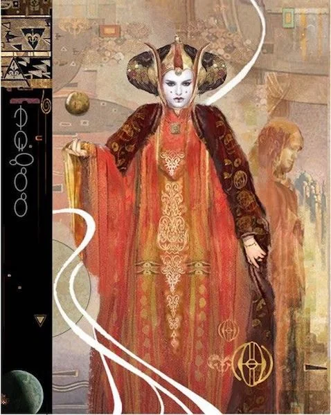
As the saying goes...imitation is the sincerest form of flattery. The more famous and well-known something is, the more likely it is it will be imitated, either consciously or unconsciously. Sometimes the connection is obvious and sometimes not so much. The connection between the Deadpool poster and the Norman Rockwell painting is clearly obvious. The connection between the Toys poster and Magritte's "Bowler Man" painting is not as obvious, but is still implied. Least obvious is the connection between the last two images, however the design of Paul Ballard's Star Wars print is very reminiscent of the style of painting Gustav Klimt used for his images.

03-deadpool_two.jpg
03-Rockwell.jpg
01-toys.jpg
01-magritte.jpg
02-ballard.jpg
02-klimt-hygieia.jpg
10363928.0.jpg

Good Design Thursdays - Entry #56

Occasionally the design for a poster has to be changed, even after the marketing material has been printed and shipped to theatres, resulting in the studios issuing a recall and informing theatres to stop displaying the images. There can be any number of reasons, sometimes it’s an internal creative change of direction and sometimes it’s due to external demands. Here are three of the more notable one-sheets that have been recalled over the years. Only months before Revenge of the Jedi was due to hit theaters, George Lucas decided to change the title of the film, resulting in a recall of the first one-sheet issued. In the case of Pulp Fiction, the studio did not get permission to use Lucky Strikes cigarettes or the cover of the book used in this first version of the one-sheet. This led to a quick recall. The studio simply photoshopped over the cigarette pack and book cover and re-issued the poster. This one-sheet for the first Spiderman movie features a bold design, with the twin towers of New York’s World Trade Center reflecting in the lens of Spiderman’s mask. Unfortunately, the poster was issued less than a month before the events of September 11, 2001. The studio took the appropriate action of recalling the poster and issuing one with a different image.

return_of_the_jedi_ver8.jpg
pulp_fiction.jpg
spiderman_ver1.jpg